How valuable is your data science project really? An evaluation guide
Performance metrics can’t tell you what you want to know: how valuable a project actually is
There is a big focus in data science on various performance metrics. Data scientists will spend months trying to improve various performance metrics for a project. The issue is, it isn’t clear that all of this effort actually provides value. If you’re only looking at performance metrics, it’s not possible to know if you’re increasing the value your model is providing.
Performance metrics don’t know how valuable your predictions are. To take one example, F1 score explicitly places equal weighting on precision and recall. In practice, there is usually a different business cost to false positives and false negatives.
You can tell you how well your model is doing using a million different metrics. But none of these tell you what stakeholders actually want to know: What business value does this have?
Money Talks
What is business value? At the end of the day, for a for-profit business, business value is monetary value.
This is great news for data scientists: we love numbers. Money is quantitative.
Unfortunately, the connection between what we’re building and the monetary value isn’t always straightforward.
One of the most concrete ways to connect a data science project to business models is to calculate what implementing that model would mean for the company’s bottom line. This isn’t always possible, but it’s a useful exercise. By looking at the situations where we can calculate an explicit value, we can clarify the areas where the connection is less clear.
A concrete example of calculating the business value of a model
Let’s take a straightforward example where we are building a model for a business problem: detecting manufacturing defects at a widget factory.
We know that if we detect a defective widget, we throw it out, leading to a loss of the manufacturing costs. The cost of replacing a defective widget is $100
If we fail to detect a defective widget, we ship the widget to a customer, and then have to replace their widget and pay for shipping on the new widget. Let’s say the shipping cost is $50, on top of the $100 loss from replacing the widget.
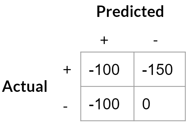
If we have a model for predicting defective widgets, we can then write out the costs for different scenarios:
True positives: -$100 for being down a widget
False positives: -$100 to replace widget we thought was defective
True negative: 0 (we’re considering “no defect” to be the default scenario the costs are compared against)
False negative: -$150 to ship replacement widget
 Credit: Tommy Blanchard
Note that this is equivalent to saying the cost of a false positive is $100 (the difference between false positive and true negative) and the cost of a false negative is $50 (the difference between a false negative and a true positive).
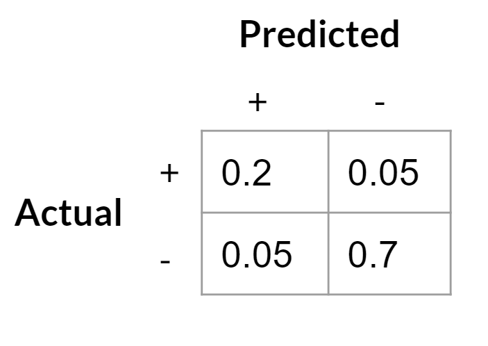
We can now build a classifier, and calculate for that classifier what the cost from defects would be if we used that classifier as our screening process. To evaluate the business value of the model is straightforward — we just need to produce a confusion matrix on the test set. Let’s take an example:
 Credit: Tommy Blanchard
Then we multiply the cost of each outcome with the proportion of times that outcome occurs:
(-100*0.2) + (-100*0.05) + (-150 * 0.05) + (0 * 0.8) = -32.50.
In other words, on average, for each widget we will lose an average of $32.50 due to defects if we use this model.
We can compare this to the cost of the current policy. Let’s assume that currently there is no screening for defects and all widgets are shipped. Based on the confusion matrix above, 25% of widgets are defective. So to calculate the cost of this policy, we just multiply 0.25 by the cost of shipping a defective product:
-150 * 0.25 = -37.50
This policy costs an average of $37.50 per widget. Therefore, implementing our model to screen out widgets will save the company an average of $5 per widget.
That’s it! We’ve calculated the business value of our model. Of course, in the real world there may be costs to implementing a new policy, and those costs would have to be compared against the calculated gains of implementing the model.
Asymmetric costs shift the optimal decision threshold
With an explicitly defined cost matrix, we have opportunities to finetune our model to minimize costs further.
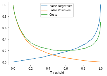
Most classifiers by default use a probability decision threshold of 0.5 to determine what to label positive or negative, but with asymmetric costs that’s not necessarily the best threshold to use.
For example, in this scenario, false negatives cost more than false positives ($100 for false positives vs $50 for false negatives). This pushes the optimal decision threshold lower; false negatives are less costly than false positives, so we should be more willing to take on false negatives.
Here is a simple simulation of what the cost curve could look like for this cost matrix (note that the minimum on the cost curve is around 0.7, so that would be our optimal decision threshold):
 Credit: Tommy Blanchard
An example cost curve for different probability thresholds. Costs have been normalized so that 1 is the most costly scenario.
Therefore, we should label anything with a prediction probability above ~0.7 as defective, and everything else as not defective.
Changing the costs matrix
It’s important to realize that a change to the cost matrix can change not only the business value of the model, but also the optimal decision threshold.
For example, let’s say someone at the company has developed a new test for defective widgets. It’s costly, so we don’t want to use it on every widget, but it definitively tells us if a widget is defective. If that test costs $20, we get a big change in the cost matrix for our model:
True positives: -$120 ($100 for the cost of production, and an additional $20 for a definitive test to make sure it is defective)
False positives: -$20 for the cost of the definitive test, which will exonerate good widgets
True negative: 0 (we’re again considering “no defect” to be the default scenario the costs are compared against)
False negative: -$150 to ship replacement widget
 Credit: Tommy Blanchard
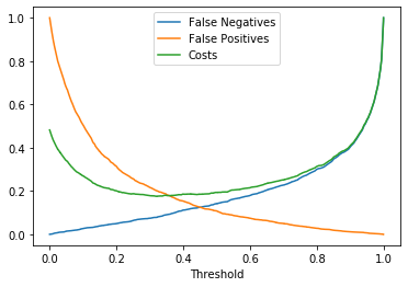
Because the cost of a false positive is now lower, this shifts the payoff curve. We should now be more willing to have false positives since they are not as costly, while false negatives remain just as costly:
 Credit: Tommy Blanchard
With the change in the cost matrix, the cost curve shifts. Costs have been normalized so that 1 is the most costly scenario.
The optimal decision threshold that minimizes costs has shifted to around 0.3. We’ll label many more widgets as potentially defective, but that’s fine since now we’ll be submitting them to further testing instead of throwing them out. We can calculate how costly this policy will be overall, and compare it to other policies (for example, doing the $20 test on every widget).
Generalizing in more ambiguous situations
In the real world, it’s rare that we have such a well-defined problem. Defining a business problem in this way is what I’ve referred to as the hard part of data science.
In the real world, costs aren’t well known and it’s rare to have a straightforward classification problem that completely captures the essence of the business problem. However, by looking at these simplified cases, we can approach the more complicated problems with greater clarity. Recognizing what is ambiguous or missing in a project definition is the first step towards clarifying the problem and connecting it to a technical solution that brings the most business value.
Author: Tommy Blanchard
Source: Towards Data Science


